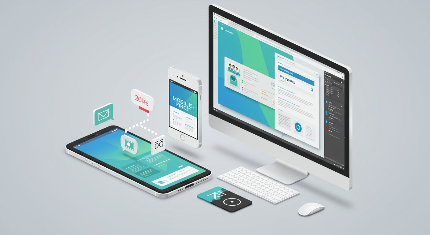
Mobile-First Design: What It Is and Why It's Crucial for Your Website
The digital landscape is undeniably mobile. With more users accessing the internet via smartphones and tablets than desktops, a mobile-first approach to website design isn't just a best practice—it's a necessity for survival. Ignoring this reality risks losing a significant portion of your potential audience and impacting your business's bottom line. This article will explain what mobile-first design entails and why it's crucial for your online success.
Understanding Mobile-First Design
What Does It Mean?
Mobile-first design prioritizes the mobile user experience. Instead of designing for desktop and then scaling down, you begin by creating a streamlined, optimal experience for smaller screens. This means prioritizing content readability, intuitive navigation, and fast loading times on mobile devices. Only after achieving this core mobile experience do you then adapt the design for larger screens.
Why Is It So Important?
- Increased User Engagement: A mobile-friendly website leads to higher engagement rates. Users are more likely to browse, interact, and convert if your website is easy to navigate and visually appealing on their phones.
- Improved Search Engine Rankings: Google and other search engines prioritize mobile-friendly websites in their search results. A mobile-first design is a key factor in improving your SEO.
- Enhanced Brand Perception: A well-designed mobile website reflects positively on your brand, showcasing professionalism and attention to detail. A poor mobile experience can damage your reputation and lose you customers.
- Higher Conversion Rates: With a seamless mobile experience, users are more likely to complete desired actions such as making a purchase, signing up for a newsletter, or contacting you.
Implementing a Mobile-First Strategy
Key Considerations
- Responsive Design: Utilize responsive design principles to ensure your website automatically adapts to different screen sizes.
- Content Optimization: Prioritize clear, concise content that is easy to read on smaller screens. Break up large blocks of text with headings, subheadings, bullet points, and visuals.
- Intuitive Navigation: Implement simple, user-friendly navigation menus that are easy to access and navigate on mobile devices.
- Fast Loading Speed: Optimize images and code to ensure your website loads quickly on mobile connections. Slow loading times are a major turnoff for mobile users.
- Mobile-Specific Features: Consider incorporating features tailored specifically to mobile users, such as tappable call-to-action buttons or easy-to-use forms.
About Alper
My expertise lies at the intersection of AI automation, digital strategy, and personal development. I leverage my deep technical understanding of AI workflows and digital marketing to empower individuals and businesses to thrive in the ever-evolving digital world. I combine this technical proficiency with a human-centric coaching style, helping you not only build a successful mobile-first website but also navigate the challenges of digital entrepreneurship and personal growth. This focus on both the technical and human aspects allows me to provide comprehensive solutions that deliver measurable results.
Conclusion
In today's mobile-centric world, a mobile-first approach to website design is no longer a luxury—it's a necessity. By prioritizing the mobile user experience, you can significantly improve user engagement, search engine rankings, and ultimately, your business's success. Don't let a poor mobile experience cost you valuable customers and opportunities.
Get your custom income-strategy session today and let's build a mobile-first website that drives results for your business!

 using WordPress and
Comments are closed